
The design of your website will have a significant impact on your conversion rate because it impacts how visitors interact with your brand. Generally, the more visually appealing and efficient your website is, the better your conversion rate will be.
Your web design choices will ultimately impact your ROI, so it’s essential that you adjust your website’s design to fit the needs of your audience. Let’s look at five ways you can tweak your website to boost your sales.
1. Make it easy to get in touch from any web page
To encourage sales, evaluate your website to see how you can remove friction from your customer experience. The best way to do this is to make it super simple for visitors to contact you from any page.
If prospective customers have a question or concern, they’ll want to get in touch. However, if it’s difficult to do this, they’re likely to leave without making a purchase and continue on to your competitor’s site.
It’s incredibly important to provide several contact options for your users so they can choose the method that is most comfortable for them. Here are some examples of contact methods that should be available through your website:
- Phone
- Live messaging
- Contact form
To clearly display your contact options, place them in multiple locations. In addition, put clickable “contact us” buttons on the bottom of each page, so users can easily reach out.
You can also create a “Contact Us” page and link to it in obvious places, like the top menu or a dropdown menu. Your visitors should be able to find out how to contact you from any page on your website, so be strategic with how you display these details. If customers know you’re easy to reach, they are more likely to think about your brand positively.
2. Use imagery that will build strong connections with your audience
Consumers want to buy from companies they feel a connection to. So, to make more sales, you need to develop those strong relationships with your audience. Choosing powerful and engaging imagery can help with this.
Visitors will typically see your imagery before reading your page copy, so choosing the right pictures to represent your brand is crucial. Here are some examples of strong imagery that will drive sales and build connections:
- Photos of people who look like your customers using your products
- Images of your staff to humanize your business
- Emotive images that your audience will connect with
- Pictures from social media showing real people using your products
When your customers see themselves reflected on your website, there is a better chance of them connecting with your brand messaging. Let’s look at a company that uses imagery to build a connection with its customers.
Capital One, an online banking company, uses images that reflect a diverse range of customers. This allows a larger population of consumers to connect with the company. They use imagery to show real people using their services, and this helps make the giant corporation feel more connected to each customer on an individual level.
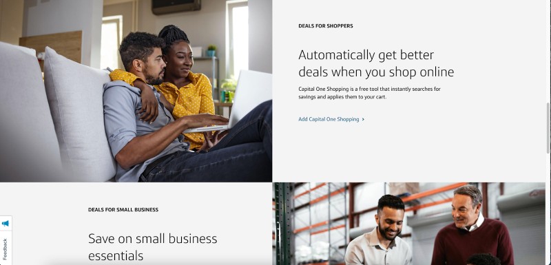
The images the company uses reflect a scene of comfort and confidence that allows customers to connect with their services emotionally. Capital One has done a great job of choosing images that evoke positive emotions, which will help visitors forge positive relationships with the brand, and you can use similar design choices on your site to help build a relationship with your customers.
Consider your target audience when choosing imagery for your website. Always pick images that show exactly what you want your customers to associate with your business. Visuals offer a great way to build solid connections and drive sales through your user experience.
3. Dedicate space to positive customer reviews
Online shoppers need to have faith in what they are purchasing. That’s why offering different types of social proof is so important for boosting your conversions. It provides solid evidence for new customers that your business is legit and offers excellent products or services.
You should make it super easy for customers to leave their feedback. Send them an email or push notification reminder. And remember to ask for reviews soon after purchase. Consider offering incentives, like a discount coupon, for leaving a product review on your site. You could even collect reviews through social media.
Once you have a good collection of social proof, you’ll need to display it prominently on your website. Here are some ways you can incorporate customer reviews into your website design:
- Display star ratings beneath product images
- Showcase 1-3 customer reviews each week in your header
- Create a scrolling carousel of solid customer reviews
When visitors read positive feedback from previous customers, they will understand that their experience is likely to mirror what they have read. Let’s look at some companies that use positive customer reviews to help build trust with its readers.
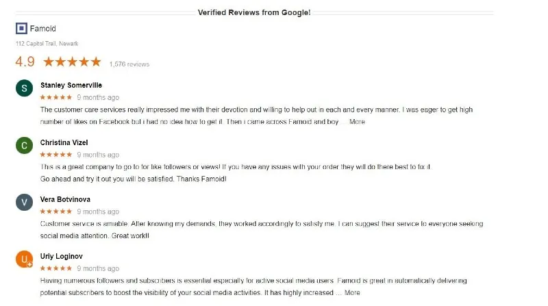
Social media service provider Famoid has done a great job of incorporating their reviews from Google into the design of their website. Because Google verifies these reviews, it adds a layer of credibility to the company’s marketing strategy that helps establish trust with readers.
Since Famoid is a service-based company, displaying reviews like this lets visitors know that they can deliver results. The reviews provide positive reinforcement for potential customers as they consider making a purchase. So, when designing your website, be sure to include lots of positive reviews on your product and service pages to drive more sales and close more conversions!
Positive reviews are just as critical for websites selling products, too, because they allow customers to compare different items to find the best solution for their needs.
For instance, take a look at GroomsShop, a groomsmen’s gift website. They knock it out of the park by displaying star rating averages and the total numbers of reviews right beneath their products.
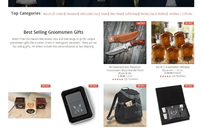
Placing reviews right by their products allows customers to quickly identify the most tried-and-true items that previous customers have enjoyed. Not only does this make the decision-making process more straightforward, but it shows that their products have been purchased and reviewed by real people.
As you design your website, proudly display positive customer feedback where users can easily find it. Star ratings offer an excellent way for visitors to spot your most popular products since consumers are used to looking for 5/5 star ratings. In addition, connecting your verified Google reviews adds another reason for new customers to trust your company.
4. Ensure converting is always incredibly easy
When customers are ready to purchase from your site, they will want to follow as few steps as possible to complete the transaction. The easier it is for someone to move forward with your business, the more likely they’ll be to make a purchase. So, you should ensure people can quickly take the next step on your site without any problems.
Getting your web design right is vital for simplifying the conversion process. For example, if mobile users constantly have to zoom and pinch to see your page, they’ll be more likely to bounce to a site optimized for mobile.
Make it easy to convert by simplifying the process. Remove distractions and make the first step in your user experience apparent. Your web design should be simple so customers can quickly identify how to reach out to use your services or buy your products.
Let’s take inspiration from companies that use excellent design choices to make it extremely easy for customers to convert in as few steps as possible.
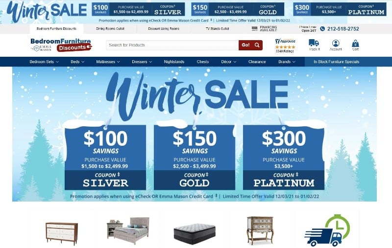
Take a look at the design of Bedroom Furniture Discounts’ website and notice how they have placed their search feature front and center on their homepage. This can help customers find the products they need without clicking through lots of different pages.
Since users may not know exactly what they’re planning to buy when they land on the website, conducting a search is the natural first step. So, the company has ensured its search feature is prominent and located right in the header where customers will not miss it. This will encourage visitors to search their website and identify the products that will fit their needs. It’s important to implement a similar design on your site if you want to help your customers find the right products at the right time in as few steps as possible.
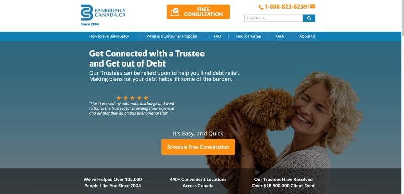
Another company that does a fantastic job of simplifying the conversion process is Bankruptcy Canada. This bankruptcy trustee service provider makes it easy for customers to schedule a free consultation straight away. Their bright orange buttons stand out against the background and simple design of the website, which makes it easy for visitors to see how they can get in touch with the company to get their questions answered quickly.
It may be tempting to fit as many components as possible into the design of your website, but it’s best to keep it simple so you can direct your audience towards taking the right actions on your site. Your customers shouldn’t find themselves distracted or disorientated by your design choices because, if they do, there is a high likelihood that they will not make a purchase.
5. Always point customers in the right direction with calls to action
Even the most observant customers need some guidance on converting. A call to action, or CTA, is an instruction that you can give prospective customers to direct them to take the next step in their buying decision. It will help to boost conversions by taking the guesswork out of how customers should navigate through your sales funnel.
CTA buttons can direct the user to sign up for a consultation or find the product they are looking for. The important thing is that your CTA stands out from the rest of your site. Optimize your CTA for mobile viewing, too.
Here are some ways you can guarantee your calls to action get results:
- Choose a button color that stands out and draws the eye
- Keep your design simple to avoid clutter around the CTA
- Use direct language that creates a sense of urgency
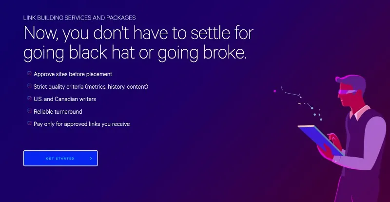
At Loganix, we have chosen a striking blue color for our CTA buttons, like on our link building services page, as illustrated below. We apply the same design choices to other pages because it helps our content stand out from the darker purple background while still fitting with the rest of the design elements.
We also haven’t placed many design elements around the button, making it stand out even more as a place for users to click. Plus, we’ve used direct language with “Get Started” to help guide our readers to a specific action that we want them to take.
Always make sure your CTA button stands out from the rest of the page. Choose an eye-catching color that matches your branding and keep the design around it simple. Never crowd your CTA with text or imagery. It should be crystal clear where visitors need to click to move to the next stage and take the action you want them to.
Summary
Your website will provide the first impression visitors have of your business. Make it a good one by using intelligent website design to show your company is credible and to inspire users to convert.
Investing time and money into your web design is a smart way to boost sales and increase brand awareness. Tweak your website with these tips, and you’ll see a big jump in your ROI.
Author bio
Adam Steele is the COO at Loganix, an SEO fulfillment partner for agencies and marketers. We build easy-to-use SEO services that help businesses scale. If you liked this article, please check out our SEO guides and templates on the Loganix blog.