When someone lands on your website, you only have a few seconds to make a lasting impression. Visitors will make split-second decisions on whether or not they trust your site based on a series of design choices. To make a positive impact, you need to provide a seamless user experience.
Optimizing the user experience, or UX, of your website, involves improving your customers’ satisfaction by fine-tuning your site’s efficiency, usability, and accessibility. This will remove friction from your customer experience, improve your brand’s credibility, and boost your revenue.
Let’s take a look at six simple ways you can enhance the UX of your company’s website today.
1. Ensure visitors find it easy to take the next step with you
When people land on your website, you want to make it as easy as possible for them to take the next step. This will increase your chances of making a sale.
Simplifying the conversion process will remove obstacles that keep potential customers from moving forward with your company and help you develop a successful online brand. You should help your audience find the information they are looking for quickly without getting distracted or overwhelmed.
Your UX needs to guide people towards the next step of their customer journey, and you can do this in a number of ways, such as by:
- Giving a clear call to action
- Providing a sophisticated search feature
- Making it easy for them to get in touch
Let’s take a look at a company that does a great job of leading their audience through the necessary steps to engage with their service.
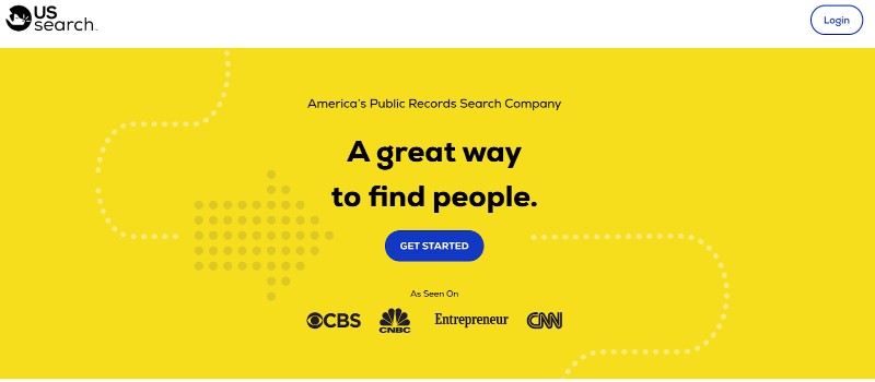
Take a look at the homepage of US Search, a public records search company. Notice how they have used simple graphics, minimal text, and a bright and easy-to-locate call to action (CTA) button. There is no confusion about where the visitor must click to get started with their research.
The easier it is for potential customers to find the instructions they need to take the next step, the less likely they are to become frustrated or confused and leave. Be sure to use the same design ideas as you see above to ensure your customers see the information they need straight away. You’ll minimize the chances of them getting lost and abandoning their journey around your site if it provides a positive UX.
When optimizing your website, look at it from your customers’ perspective. If it takes more than a few seconds to figure out how to take the next step to connect with your company, you’ll need to simplify your customer journey.
2. Use social proof to earn prospective customers’ trust
Consumers will want to know that they can trust your business, so you need to build trust and loyalty with customers through your UX design.
Word-of-mouth recommendations are compelling, and you can replicate the effects by adding customer reviews and other types of social proof to your site.
This will help new customers to feel more confident when buying from you. It can also help them set their expectations, preventing returns and customer dissatisfaction. When a customer is happy with your product or service, it helps enhance their overall experience with your brand.
Let’s look at a site that uses social proof to build trust with its customers and drive more sales.
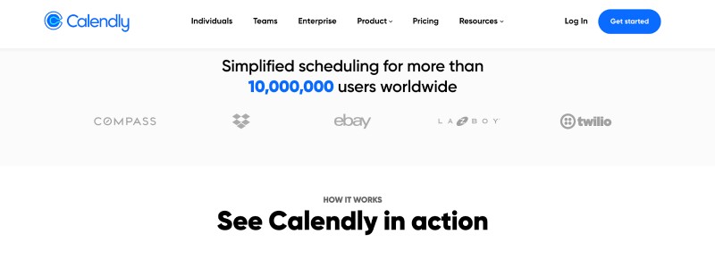
Calendly, an online scheduling program, tells users that more than 10 million people use their product to simplify scheduling. Additionally, they include the logos of famous brands, like eBay, that utilize their software.
When visitors see a large number of satisfied customers and some highly recognizable names, they will feel more comfortable interacting with the website. You can use the same UX approach that Calendly does by adding customer reviews, video testimonials, and social proof with statistics to provide an additional layer of credibility to your online marketing strategy. All of these elements should help you drive more conversions!
3. Make your website accessible so anyone can use it
Part of providing a positive user experience involves ensuring your website is accessible to all — even those with specific impairments that require special accommodations.
According to BusinessCloud, there are 14.1 million people living with a disability in the U.K. alone. This translates to a large portion of your target audience who may require digital tools to fully access your content.
Not only will website accessibility improve your UX, but it will enhance your brand’s reputation as you create an inclusive experience. Some ways you can make your site accessible include:
- Adding alt text to your images
- Simplifying your navigation
- Making sure your website’s text contrasts nicely against the background
- Transcribing videos and offering closed captions
- Making your content accessible
Remember that anyone who lands on your website should be able to use it, even if they need some assistance to do so.
4. Ensure your navigation menu is intuitive
To provide the best possible UX, it should be effortless for website visitors to find exactly what they need on your site. If they can’t, they’ll be far more likely to leave your website without making a purchase.
There are lots of different ways you can help people navigate your site. It could be by the type of people they are, such as a student or a teacher, or by the problem they are having and the solution they require.
Here are some tips for crafting a navigation menu that will help your audience through the customer journey as quickly and easily as possible:
- Keep your navigation consistent on all pages
- Utilize highly visible buttons
- Leave a breadcrumb trail for users to find their way back to previous clicks
- Use sticky navigation to keep menus visible at all times
You may want to consider investing in a professional web design service to ensure there are no hiccups with your navigation. Consider how your menu looks on desktop and mobile devices, and position your products and services in a way that helps customers find the solutions they need without going through large and confusing menu items.
Let’s take a look at some examples of great navigation menu designs that help potential customers find the items they need and drive more conversions.
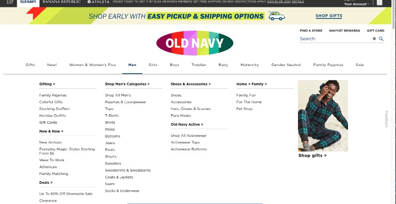
The clothing company Old Navy uses pop-up windows that allow users to hover over the clothing category they are interested in and be presented with every possible subcategory.
This allows the visitor to quickly identify their desired item and click over to the relevant category. They even leave breadcrumbs in the left-hand sidebar so users know where they are and where they can move on to next.
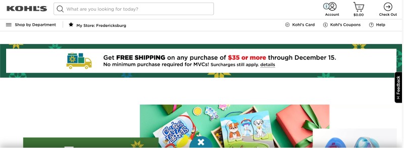
A more straightforward design comes from the department store Kohl’s, which opts for a neat hamburger navigation system in the upper left-hand corner. While Kohl’s has many items available on their website, they do a great job of organizing them into individual departments. Users can navigate their library of items in an intuitive manner by selecting the category or department they want to learn more about. Plus, every label is descriptive and straightforward, removing any mystery from the browsing process.
Whichever navigation style you choose, be sure to test different versions to see which one offers the better UX. Keep a close eye on your site metrics and ask for customer feedback to determine the most intuitive navigation for your website.
5. Publish content that provides real value for your audience
When visitors land on your site, they don’t just want to make a purchase; they want an experience. You can create an engaging UX by offering high-quality content.
Not only will unique content generate more traffic to your website, but it will also help tell your brand’s story and build a solid connection with your customers.
Your content can come in any format: videos, blog posts, buying guides, or free resources. To devise the best content strategy, consider who is in your audience and what they might need help with.
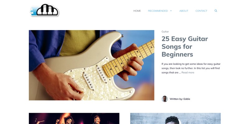
Musician Authority, a website that offers lessons for novice musicians, creates targeted content that will benefit their audience. Their most popular posts are compilations of the 20 easiest songs to play on the guitar, which are excellent resources for visitors looking to practice their newfound skills.
They also offer content that answers common questions new musicians may have and provides advice on how to get started with a band. When creating resources for your own website, choose topics that address common pain points and FAQs in a similar way. This will ensure your content offers value to your audience and builds credibility for your brand.
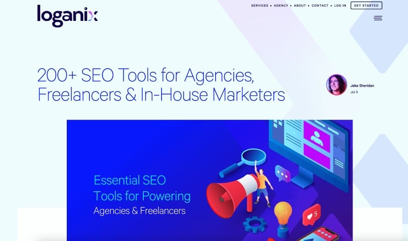
At Loganix, we create great content on a variety of topics that our target audience cares about. For example, we have created content that outlines different types of SEO tools for agencies and freelancers to educate our target audience and build a relationship with them.
You can use the same approach by offering different types of content on your website that will attract a diverse sampling of your target audience. Consider publishing blog posts, videos, and easily shareable tools to boost brand awareness and enhance your UX. Your users will begin to view you as an expert in the industry and continue to look to you for guidance, advice, and assistance.
6. Make sure your website loads as quickly as possible
Nothing causes customers to lose interest more quickly than a slow loading website. According to WebsiteBuilderExpert, 40% of customers will wait no longer than three seconds for a website to load before leaving. So, if yours doesn’t load as quickly as possible, this will increase your bounce rate and negatively impact your conversion rate.
Test your website on different devices to understand what you need to do. Remember that the mobile and desktop versions of your site may load differently.
And, to see specific metrics relevant to your website’s load speed, use the free Google PageSpeed Insights tool to identify problems you can fix right away to improve your UX.
Summary
By offering a seamless user experience to your website visitors, you will demonstrate that your company is the right choice.
You don’t need to commit to a massive overhaul to optimize your UX. Instead, make the simple adjustments we’ve outlined here to make a clear statement that you care about your customers’ experience while interacting with your brand.
Once you improve your UX, you’ll see an increase in traffic and revenue as customers connect with your company’s message.
Author bio
Adam Steele is the COO at Loganix, an SEO fulfillment partner for agencies and marketers. We build easy-to-use SEO services that help businesses scale. If you liked this article, please check out our SEO guides and templates on the Loganix blog.
